MEANS OF PRODUCTION
OvERVIEW
Means of Production is a Student Interactive Prototype featuring the start screen and main menu for a potential Soviet themed management game.
Developed on my own on Unity 2019 over the span of
3 Weeks. The objective of this project was not to create a full game, but rather to design create a functional main menu with emphasis on UX Design and UI Design.


UI DESIGN
The art style has been greatly inspired by Soviet iconography and propaganda artworks, which led me to use a gradient of reds and browns, with some yellow and cream accents to break down the monotonousness of the base palette and to direct attention where it’s needed.
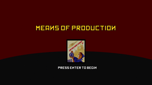
The splash screen has a simple frame, as the user can only perform one action on this screen: start the game by pressing the Enter Button. This information is provided to the player trough motion as there’s only moving element of the screen at this point: a white scaling text that says “Press START to continue” centered at the bottom of the screen, reducing almost to zero the risk of any potential user missing this simple yet key piece of information.
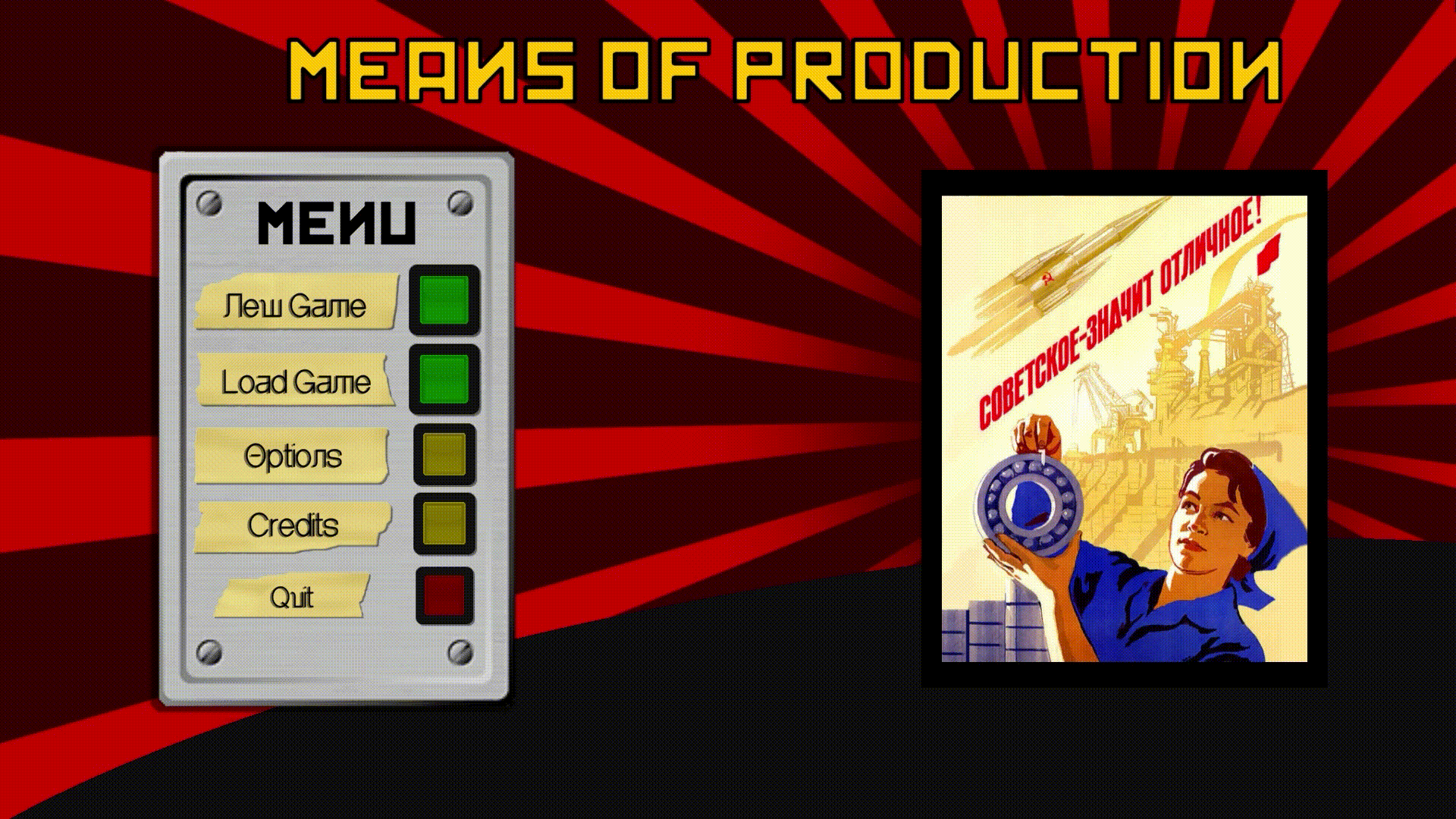
Once the Enter Key has been pressed and the splash to menu screen transition animation has played, the main menu appears, located at the left edge and taking up one third of the screen in order to make room for the centerpiece illustration of the menu, the soviet propaganda artwork surrounded by revolving sun beams.
The menu is stylized as a metal plate with different colored buttons on it (green for gameplay related buttons, yellow for options related buttons, red to quit the application) with duct tape labels that serve the purpose of explaining to the player the purpose of that specific button. The design of the Main Menu panel was inspired by the Operative Terminals of Soviet Power Plants.
Another UI element that has been heavily inspired by soviet industrial design was the Options Menu. I designed it to have a visual variety of elements that would recall analogic control panels, with a baseline visual coherency (buttons and tape labels) that would recall the format already seen in the Main Menu, but using different grouping methods and visual elements to make each option section signify a distinct purpose, such as the screen brightness section, that reminds a radar interface, or the volume slider, made vertical to resemble control panels physical sliders.
The size of buttons that would lead to gameplay (New Game & Load Game) have been increased, while the size of the quit button has been purposefully reduced.

.png)
UX DESIGN
Similar to the UI design, the UX design of Means of Production aimed at amplifying the Soviet theme, for example by using tradional Soviet music and diegetic sound feedback for menu buttons.
The opening screen immediately presents to the player as dark, with a muffled version of the gloomy soviet era song playing on the background. This is aimed at generating tension, encourage the player to move onto the next section, and create contrast with the bombastic main menu.
The real centerpiece of the UX design in this project is the transition from the start screen to the main menu: designed to give to the project that extra sense of “Oomph”. When the player presses Enter, the “Press START to continue”, the text provides action confirmation by scaling one last time before disappearing completely.
During and after the aforementioned segment, the music will change from Katyusha to the Soviet Anthem, blasting in its full glory, capturing the feeling of “Soviet Might” and delivering a powerful reminder of what the game is about to the user.
The two tracks have been mixed with a radio static sound used to both cash in on the old timey soviet theme, and to smooth the transition between the two songs in a diegetic way.
The scene composition will also change, with the platform and the propaganda art increasing in size and changing place, taking up the center/right of the screen. Once they’re in place, red and black revolving sun beams will appear from behind the propaganda art piece, further increasing the impact of the transition and further solidifying the theme of “Soviet might”.
In regards of the menu, each button lights up upon button hover, and a faint low pitched light bulb sound would play, providing the user with diegetic interaction feedback and reinforcing the Analogue Buttons theme.